

The Balancing Change quilt my guild made for Quiltcon 2016 was truly improvisational from beginning to end.
We knew we wanted to make a quilt for the Quiltcon Charity Challenge that embodies how random things become organized, how chaos ends up organizing and balancing out in the end. In the greater San Antonio Texas area 2015 saw an overwhelming amount of destruction, Wimberly flooding probably being the worst. I think we did succeeded.
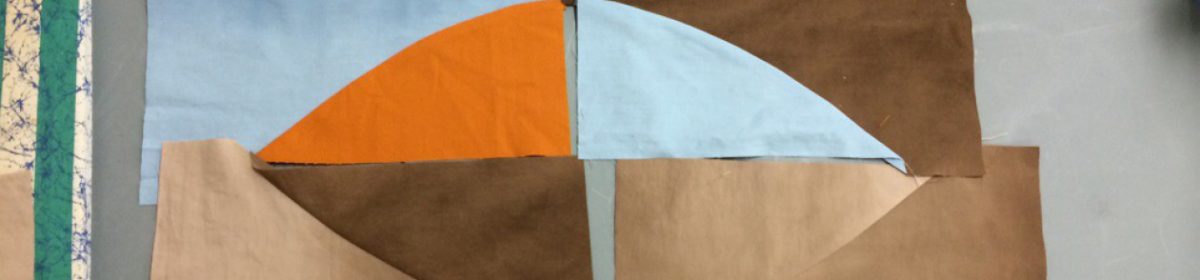
In our first sew-in, we all talked about ideas and we decided a triangle, the symbol of change, would be important imagery. We also discussed traditional blocks that we could use as inspiration, specially the churn dash, as a symbol of change. I saw this an an opportunity for me to get a beta ‘test’ of a improvisational ruleset I am working on to publish (more on that in a future post.) We added a few more rules such as scissors only, no rulers. For at least half of our group, this was a very uncomfortable situation. We all knew this quilt would expand our horizons.
Our first go around resulted in an interesting mess that didn’t inspire us to move further. We looked at it and moved parts around and it just didn’t work. So we let it rest for about a month in order to let our creative juices get to work.

Sarah Jimenez found a sketch of a black and white triangle with a couple of bars all done in pencil. It began a conversation about the concept of balancing. We considered two bars, but felt that it could be taken as a political statement and we wanted to avoid that even though there is much chaos in politics. We wanted this to be about the abstract concept of changes affecting us and not about a specific idea. Instead of directing the thoughts of the viewer, we wanted our quilt stimulate and open those thoughts.
I had also been reading a lot of design theory and wanted to apply some ideas of depth and movement through relative sizes and layering of objects.
Sarah and I worked together to combine the ideas into the final layout.
Taking the design concept of depth one step further during the quilting process I applied comic book drawing theory. In comic books line value and thickness are often used to indicate depth of field. Thinner lines with color value closer to the background indicates farther away from the viewer while bolder thicker more color value difference indicates closer to the viewer. So I used a variety of very thin 60 wt threads, and thicker 50wt and 40wt threads when quilting. I had planned on using 30wt thread too, but it required mechanically adjusting my machine to accommodate the very thick needle. There was not enough time to get out the tools before the quilt had to be in Pasadena for Quiltcon 2016. I plan on trying the thread weight ideas on a future quilt though. The idea intrigues me.
This quilt really pushed our group to get out of our comfort zone and to really think about improv as a concept that still requires design theory application to get a great results. We are all happy with the outcome. We all learned a lot. I hope this group will do this again!
MQG talks about it on Instagram
#quiltconcharityquilt, #quiltcon, #improvquilting, #quiltcon2016, #quiltconcharitychallenge

I can see from your article that you all are really learning about art designs. I never would have even realized that studying art in such detail would translate into a quilt. It’s kind of like working on a Master’s degree in quilting. I can see you learned a lot that all of you will use in future quilts!
LikeLiked by 1 person