Thread Weights and Needle Sizes for Free Motion

You may hear a lot of things about what is the best or the only weight thread to use for free motion or longarm quilting. Personally I don’t think there are any rules. As long as you choose your thread, evaluate your fabric and then choose the appropriate needle for thread-fabric combo AND are willing to tweak your tension settings, you can free motion with almost any thread. Your machine just has to accept it. Some machines can be finicky about weights of threads or even material the thread is made of. Often you can tweak or adjust your method to help use it.

Quick Guide to Thread/Needle Size
Thread Wt Needle
40 wt 90/14
50 wt 80/12
60 wt 70/10
100 wt 70/10
12-30wt 100/16
MonoPoly

(Invisible monofilament)

70/10

Normally I go to a 50 weight cotton or polyester trilobal thread. I really like threads by Superior Threads, though I am not married to their products. Using a 80/12 Topstitch needle works great with their King Tut, Manifico and Fantastico lines. I have found that as long as I use the same thread in top and bobbin of my machine, I do not have to adjust tension at all.

Note: Superior Threads note on their spools and cones which tell you which size needle is recommended for that particular thread.

If I want a thicker line of thread to show, I will use a 40 weight thread. There are free motion people out there who do not like this thread. But I believe that if the look you want requires a 40 weight go ahead and use it. A 90/14 needle works great.

Thick threads have smaller weight numbers, while bigger needles have bigger numbers. Thread and needle sizes run in opposite directions.

You can even free motion with a 30 weight thread if you want, however, put it in your bobbin of your machine. Thick threads do not work in the top of a domestic sewing machine and will shred or mess up your top tension discs. So in the bobbin it must go. This is often called “bobbin work”. The process is the same, you will just have to work from the back side of your quilt so the heavy thread in the bobbin shows up on the front. If you think your machine could handle a 30 weight thread,  you would probably use a 100/16 needle.

Thinner threads than 50 can look really neat. Using silk 100 weight thread for example can have a really nice look. Some of the top free motion people who win shows use silk almost exclusively. I would try a 70/10 needle for this.

Monofilament is also an interesting choice. Typically it is almost colorless. It will really “disappear” into the quilt so the texture is really evident and the thread is almost unnoticeable. There are two types, nylon and polyester. In years past, monofilament, which was made from nylon, got a bad rap because in the early days when it was invented it was very stretchy. So it was difficult to use. You would have to go very slow and have very low tension settings. Nylon also melts at lower temperatures than other fibers. Lower temperatures mean more stringent rules for care of the quilt, you can’t iron it, must wash on low, etc. Newer polyester fiber is in several brands of monofilament. My experience has been with Superior’s Monopoly. It requires a couple more ‘numbers’ lower on the top tension and I do tend to go slower with it. But it really has a nice look, washes on medium heat, and can be ironed. It’s great for trapunto too. Monopoly is slightly matte and that helps it disappear too. It comes in a light/clear and smokey clear for using on darker fabrics. I don’t hesitate to use the light monopoly on dark fabrics if I do not have the smoke available. It really is fun to use.

Complementary Improv Quilt named Earth, Wind, and Fire

My goal was to do a complementary colored quilt as an exercise in my exploration of the CMYK color wheel. I also challenged myself to pick the ugliest fabric I owned as a starting point.

I chose a ombre brown that looked like mud. I bought this on sale a couple of years ago and it never inspired me. I realized that I had a matching ombre blue that worked for a complementary color scheme. Initially I made about 30 blocks that were improvisational created by stacking two squares to five and cutting a curve through all them. I didn’t worry if the fabric shifted, I just used a rotary cutter to slice through all of it. Then I randomly shuffled the pieces and sewed them back together. It did not take long to realize how sleepy this soft brown and blue color scheme made me. It really needed something more. I pulled out Joen Wolfrom‘s color poster and realized that I had an orange that was actually the same color as the brown, just a different value. Wolfram is really changing how I think about color. It’s all about value. Thinking in value really simplifies things.

Bright orange is a very powerful color and in the case of this muted soft blue and brown scheme, it became very powerful indeed. Small doses were in order. I stacked up a few of the blue/brown blocks that had larger areas of contiguous fabric section and layered in an orange square and did my same improvisational curve cutting and piecing. I also sorted through my blocks and found several that were not large enough to allow me to easily square up all the blocks to maximize the sizes I could make. So I tacked some orange onto the edges of these smaller blocks to grow them. I am actually really pleased with these blocks. The fabric that I did not like, now looks like suede and the bits of orange really shape the path the eye travels over the quilt top. It reminds me of a kayaking trip with water, mud and flames.

I really need to put up a large design wall to layout all these blocks. It will have to wait for a retreat or something. I also have not decided if I will sash them like in the three row image or if I will just sew them edge to edge. I’m sure it will come to me at some point.

logo

Beginning Free Motion Class Supplies List November 25, 2014

cropped-cropped-20131208-181349.jpg
For those of you who are taking my class. Here is a link to the pdf which contains the list of supplies and pre-work that you will need to do in order to be ready for the class.

If you have several feet that might work (see pdf) and don’t know which one is best, bring them all. we can talk about them in class.

Download Supply List by Clicking Here

Fall is Here and a Pumpkin Class

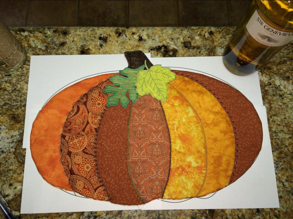
2014PumpkinClassWhat a week! Fall is here! It was 97 F yesterday and 80 F today with rain most of it. I almost got naked and did a thank you rain dance. I’m sure my neighbors were thankful because I rescued them from the ghastly vision of my interesting bits by deciding to go shop hopping instead. It was much more important grab two more shops on the Quilts Across Texas Shop Hop than it was to frighten the rain gods into dumping more water on me in an effort to make put my clothes back on. We got plenty of water today.

This past week my friend Jamie reposted a photo of a class sample that I did back in June. She showed off the quilt as you go watermelon table runner. Jamie got a big response from her Facebook peeps and they asked me to teach it again. I will in the spring. I offered to do something “Fall or Christmas” instead. We talked and decided a pumpkin would be very apropos for the next two months at least. So a pumpkin it is.

There are some vintage looking quilt as you go pumpkins made of strip piecing. At first I though we’d do that. It would be made just like the watermelon table runner but a pumpkin. Sounds easy. I decided to actually make a sample this time.

But as things go in my world I decided to change the plan just a bit to make things prettier.

There is absolutely nothing on a pumpkin that is a straight line. So, I decided that instead of strips, we’d do curves instead, easy-peasy no-pin mild gentle curves that would suggest the 3D shape of the pumpkin. Great! I drew out a pattern and it is beautiful! Oh no! I realized we can’t do the stitch a strip and flip it over technique as easily now. We got those curves to deal with. This is intended to be a beginner level class… so what am I to do?

I have said all year that I would teach a Fast Piece Applique class à la Rose Hughes style. It’s fun, it’s fast, it gets fabulous results in a short time. Her books are great and I tell my peeps to, “buy them, buy all of them. Rose’s books will inspire you and teach you stuff, she’s great!” I decided that this is my chance to spread the news about the greatness of Rose. However, Jamie and I did put the news out that this is a quilt as you go kind of beginner class. So what to do?

I decided we will do Rose’s technique and mangle it into a quilt as you go kind of thing and shorten the process just a bit. I put it together tonight, and because of the big pieces of pumpkin, it will work just fine. I think this is gonna excite my class! I’m excited to share it.

I was really surprised how the process fell together and how it sped up making the whole darn pumpkin centerpiece. And, best of all, it was fun and not that complicated.

I’m not going to show how I did it yet… I want to find any interesting foibles by making another sample tomorrow. For now… Here is a pic of what I did in just under an hour and 30 minutes.

Modified Fast Piece Applique Quilted Pumpkin

Pet Post Cards

SAMQG is doing pet post cards as a charity outreach project and the cards will be available at the Houston Quilt Show 2014. I was inspired to make these by a memory of my bad cat who tormented my fish. Actually, I always thought the fish were tormenting the cat. He never managed to catch a fish. Though he did get wet.

My Bad Cat Pet Post Cards

We made post cards that used all kinds of techniques. My Bad Cats are raw edge appliqué and have a rat tail cord art quilt edging method to finish them off.

The rat tail cord edging is actually pretty easy. First use a narrow long zig zag to seal off the edges of your quilt sandwich. Then widen your stitch just a teeny bit, lay a rat tail cord right next to and touching the edge and zig zag it on the quilt. THEN, widen your stitch just a bit more and change the length so it is not quite a satin stitch. Since you stitched around twice already, there is enough thread already laid down that a true satin stitch won’t be necessary for a neat and pretty finish.

I’ll show in some future post how to make the ends of your rat tail edge meet up nicely.

Lumi dyes are intriguing!

Do you know you can use airbrush paints to pseudo dye fabric. You can heat set them after they dry and they are wonderfully permanent. Also, I use Derwent Inktense pencils and blocks to dye and paint fabric. They also become permanent after drying and can be heat set too. Which leads to some really interesting effects if you layer on colors while drying and heat setting in between rounds. And, I’ve been pondering the idea of getting into real dying with chemicals and vats and all that. I haven’t made that leap into yet another big mess yet. Then I saw a new thing when I was wandering around the art store. Lumi. Lumi dyes are photo sensitive.

With regular paints and dyes you can get a big of a photosensitive effect due to unequal drying and wicking of moisture through fabric and some paints and dyes are somewhat photosensitive. However this Lumi dye is like doing old-fashioned photo printing on fabric instead of photo paper. 

You spread the stuff on the fabric, put a printed transparency (your photo negative) on top, lay the stuff in the sun for 10-20 minutes (or maybe 30 on a cloudy day) and wa-la! You have a mono print. 

Today I”m trying a photo transparency, laying objects on the Lumi coated fabric, and printing using the Lumi inks. 

You can also layer different colors of Lumi dyes. Print and rinse. Dry and printing again. You can get some really interesting effects this way.

Cheapest quilting and sewing tool I own! Pencils!

Did you know regular old yellow number two school pencils are 1/4 inch in diameter? I always have them laying around to mark things.

What a quickie tool to grab to measure a seam allowance!

Did you know you can tape two yellow pencils together and then the center of their leads will be 1/4 inch apart?

What a quickie way to draw a line 1/4 inch away from another line!

What a quickie way to draw two lines 1/4 inch apart!

My Insights on Color Theory and Why CMYK Rules my Universe.

CMYK rules my art world. And, it should rule yours. I have known about and used both RGB (red, green, blue) and CMYK (Cyan, Magenta, Yellow, K (I’ll explain the K later) for years. But I really didn’t understand them until now. I thought CMYK just was something printers had to do because of the inks they used.. and I was kinda right, but mostly wrong. It had to so with the inks, the paper, the coatings, the …well.. the everything.

I’m taking a class is all about CMYK and why it is better than RGB for my art. RGB is what we learned in elementary school only because it is easy to show. RGB is for transmitted light. RGB is about adding colored light together to create. Starting from nothing, the absence of light, adding light of specific colors until you reach your desired outcome.

CMYK is about starting with white light and subtracting colors until you reach your desired outcome. CMYK is for light-absorbing color processes. Quilts, fabric, paints and inks are ‘colored’ by all reflected light. But it is light passed through light-absorbing pigments in the form of ink, paint, dyes, and more. A CMYK color wheel will really help you get the best results when using these mediums. C-Cyan, M-Magenta, Y-Yellow, K- key (the key or color plate is used in printing to determine the lightness or darkness of the CMY). They don’t mention the K part in the class specifically, but they do talk a lot about it. Every time they are talking about tint, shade, or tone.. they are teaching us about the K part of CMYK color theory.

We were all short-changed in K-12 when it came to color theory unless you had a really rocking art teacher who had lots of time. If you took drama classes you necessarily taught RGB. Theater uses light and lots of it. Theater uses light passed through gels (transparent colored films) to “color” the light. RGB is all about transmitted light. It’s really easy to show RGB color theory and limited budgets meant most schools taught RGB theory. A few colored gels, a source of white light and, wa-la, you had an easy quick demonstration on RGM. Lightness or darkness in RGB is controlled by the amount of light you allow to shine through. 

CMYK. Now that is the true beast we need to learn for doing art (that isn’t working directly with manipulating the light itself). In CMYK, the lightness or darkness is a result of two things. 1) the pigment itself and how a human perceives it. and 2) the amount of white or black mixed into the pigment). Number 2 is a very different animal than just dimming or turning up the electric current in a light. Human perception is obvious for those of us who can see. For example, Yellow is ‘lighter’ in perception than Purple. 

In CMYK color theory, color passes through the pigments/dye/ink on the paper (they absorb some color) then reflects off of whatever surface is under the pigments and back through the light absorbing pigments before going to your eye. So you can think of CMYK as subtractive. Color is subtracted (absorbed) or removed from the light bouncing off the background behind the pigments laying on the surface. It is also affected by the background surface. And, it is subtracted (absorbed) again when the light passes back up through the pigment back to your eye. The background plays a huge role in all this. Traditionally the background is white, white canvas, white fabric, white paper, white gesso, etc.

In CMYK you can create black by mixing all the colors together. In practice, this actually end up looking like a dark mess. That is because it is really hard in nature to find 100% pure colors, or to even create them out of things we find on earth. Everything we create is slightly tainted. So actually finding three pure CMY colors and mixing them exactly has astronomical odds against it happening. Also laying on enough pigment to absorb all the light is a requirement. This could end up looking like a thick scab. This can get really nasty if you ask me. So printers and artists for thousands of years have “cheated” by making black pigments. Actually they are just made of things that are really dense and absorb a lot of light like coal. Anyway, using black pigment with the three subtractive primary colors allows wonderful things to happen. It’s why your inkjet printer today uses at least four inks, Cyan, Magenta, Yellow and Black is used for the key). Black is used when the muddier combo color of the CMY isn’t desired. To get a really rich black, printers will often mix a layer of CMY with a layer of black over it. Newer printers often have a “Photo” black cartridge. This is actually CMY and Black inks together. No biggie.. it just works.

To get lighter ‘colors, you just use less pigment so less absorption of light occurs. This isn’t always practical either. Our eyes are super sensitive detectors. We would have to grind down the pigments to itsy bitsy teensy weensy bits and sometimes we can’t grind them down enough. We’d also have to evenly and at regular spacing spread the pigments out at just the right rate to get the color we want. All that is terribly hard. So again, artists have been “cheating” for years by using “white” pigments as a carrier substance to thin out the colors and spread them out. No biggie.. it just works.

Having the K factor is the Key… it allows us to take a pure color and thin it down to make lighter colors or thicken it up (and even add black) to make dark colors. 

You can even include the K factor as your substrate, using a grey or black back ground will allow you to achieve changes without having to even alter your pure color pigments.

All that is nice.. but how does it apply to quilts..

As well as making different color choices now, I think about the K factor (lightness/darkness/value) as much as the color itself. I realized I used to pick all the colors but they usually had the same K factor. So if I made a green and blue quilt (analogous color scheme) I had all light, or all medium colors in terms of  how light/dark they were. Because I am studying CMYK, I think about the K factor (lots of pros call it value or include it in their value definition). So now if I were to do an analogous color scheme quilt, I also make sure I have some light, some dark, some medium mixed up in the actual colors themselves.

Does it work? All I can say is that it does! Try it. If you are used to using a color wheel as a guide to help you choose fabrics for a quilt… Go pick fabrics using a CMYK color wheel, also known as an Ive’s Color Wheel, and watch your once drab color picking skills suddenly become professional. Remember the K factor part of CMYK and You’ll be quilting with the stars.. at least with your color choices. 

I know people are saying things about my art that they didn’t before.. they are saying things like wow, I love those colors, I didn’t think of putting those together but it really does work well, and more. They never commented about my choices before I made the switch. They do now. And more importantly I think so to. 

Wonder tape makes for professional looking pillowcase finishes.

I have discovered Wonder tape! Love this stuff. If you are doing a pillowcase type finish and just can’t get those pesky edges to fold in and stay aligned, wonder tape is your friend! It is two sides and tacky so you can reposition the cloth to your hearts content and when you are happy you can use an iron to fuse it down to it will stick really hard. Then you can sew it. It’s a convenient 1/4 inch wide so makes getting that seam to match with the other side of the opening you want to close really easy. After you sew it, it will seems kinda stiff with that tape in there. But it sewed easy and didn’t gum up my needle. The wonder part comes after you wash the item. The tape dissolves away and disappears leaving no trace it was ever there!

I used this in my free form table runner class yesterday and the students projects came out fabulous. Even the beginner never ever sewed before student produced a really well done project. You could not tell where the opening was that was used to turn the table runner inside out.

Spiral Eye Needles are The BEST Invention EVER!

Pam turner creating her prototype Spiral Eye Needles

Spiral Eye Needles are The BEST Invention EVER!

I found these spiral eye needles about two years ago and I have fallen deeper in love with them every time I use one. Pam Turner had an idea and invested her life savings in it because she felt it was so good. I agree with her. 

Her easy threading needles blow the Clover top loading (not-so-easy) needles completely away. Pam’s needles are ‘side’ loading.. get that? Side loading. That means the thread goes in from the side. The advantage is the thread isn’t pulled out of the end slot when going through the fabric because THERE IS NO END SLOT. This easy threader stays threaded. 

I use this most of all for burying quilt threads on my long arm. But I multiple size of her spiral eye needles and use them for embroidering, beading and other quickie things. 

The only minor problem I have found is when embroidering if I have the side slot turned towards the fabric and pull the needle through with pressure. In this situation, once in a while the fabrics weave can get caught in the slot. The advantage of not having to strain my eyes when threading far outweighs this. It’s easiliy solved by spinning the needle so the slot is not pulled against the fabric as I stitch.

As I get older, my eyes switch more slowly from distance vision to close up. Threading needles has become harder and takes longer because of it. The Spiral Eye Needle actually is faster to thread even when my eyes are focusing well. I’ve given a few of them as gifts. 

These aren’t the most inexpensive needles you will ever buy, but they are the cheapest if you count the amount of time you spend threading and if your vision is a little bit off they will save you even more time.

I had a professional longarm friend tell me that the spiral eye was too expensive for her to use. I asked her how long it took her to bury threads… 10 minutes to an hour depending on thread changes… Most pros get paid by the square inch. If you could cut the thread burying time to 25% of what you spend now… how many more quilts can you get done. This is a cheap investment for a pro. And for someone like me… it’s a godsend for my eyes, sanity, and patience. 


Plus I use one of those little strawberries with sharpening grit. My favorite two year old needle is just as good and sharp as the day I got it. 

Note: These are photos from Pam’s website http://www.spiraleyeneedles.com/